

Thursday 18th of June 2026 - Last Update: 18:32
")


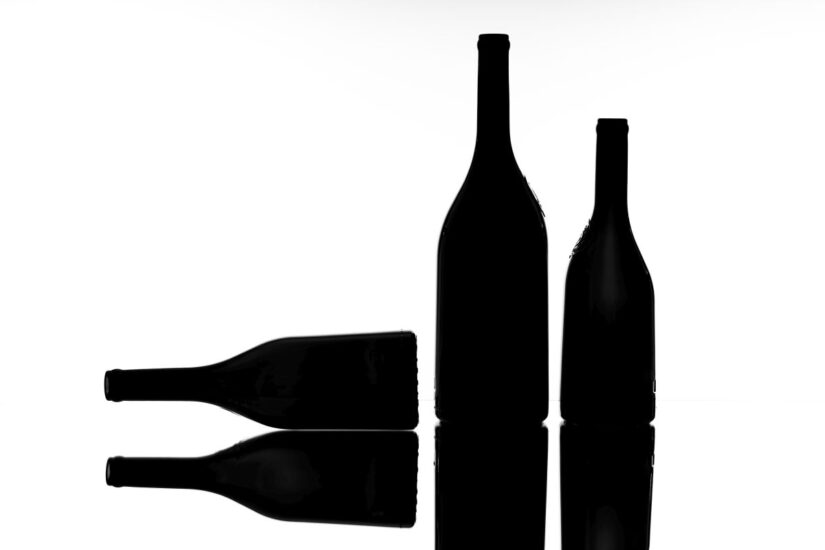
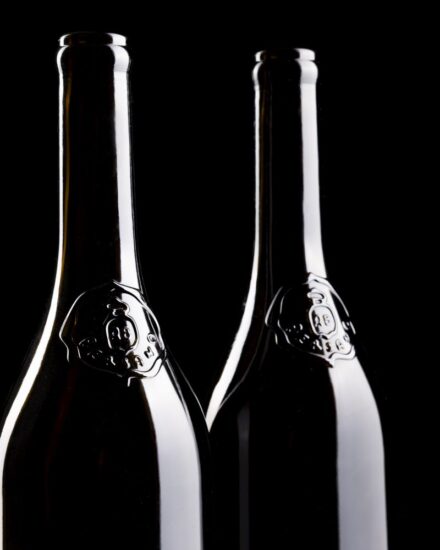
It was the first half of the 20th century when, at the La Cremosina estate, ancient bottles were discovered, attributed to the period of Napoleon Bonaparte stay in the countryside of Marengo in Piedmont. Their shape struck Arturo Bersano, leading him to anticipate, well ahead of his time, how, in the world of wine, even the bottle, with its “Napoleonic” silhouette, could become a mark of recognizability and value for his company. A story which today meets made in Italy design and returns to where it all began. Mario Di Paolo, from the creative and design studio Spazio di Paolo - specializing in wine & spirits and with more than 300 international awards to its name, including “Designer of the Year at the Pentawards” 2021 and artistic director of the Vinitaly Design Award - redesigns the Icons, the collection of Bersano most representative wines. Bersano is one of the reference wineries of Piedmont, the Langhe, and Monferrato. He reinterprets the historic bottles in a contemporary key, preserving the continuity of the company history - so much so that the phrase by Arturo Bersano, “sit, drink and be joyful, ave” is engraved on the base - while introducing change starting from the label. But the collaboration goes further, as the project inaugurates a new phase in the winery visual identity and brand, bringing to the surface authentic elements of a story nearly 120 years long, expressed through a contemporary language.
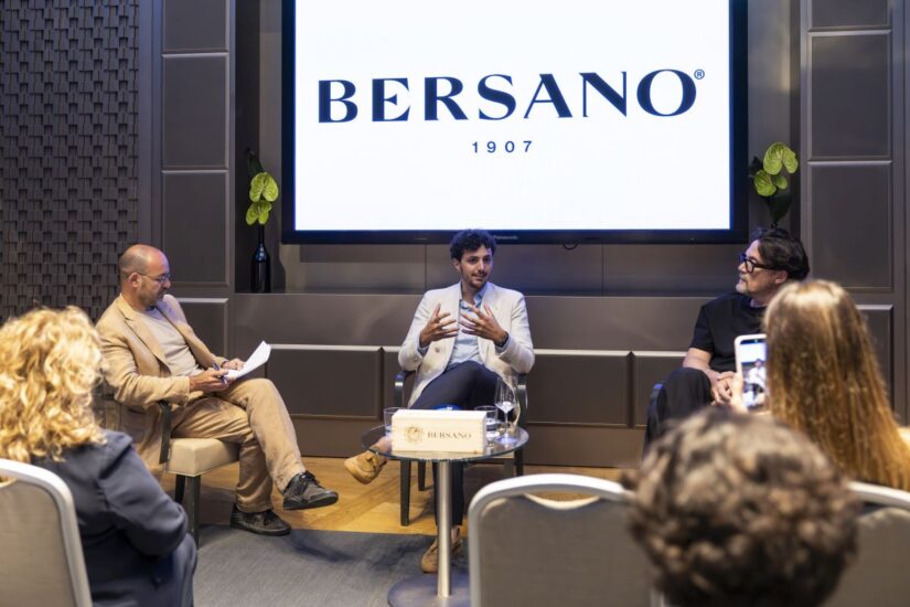
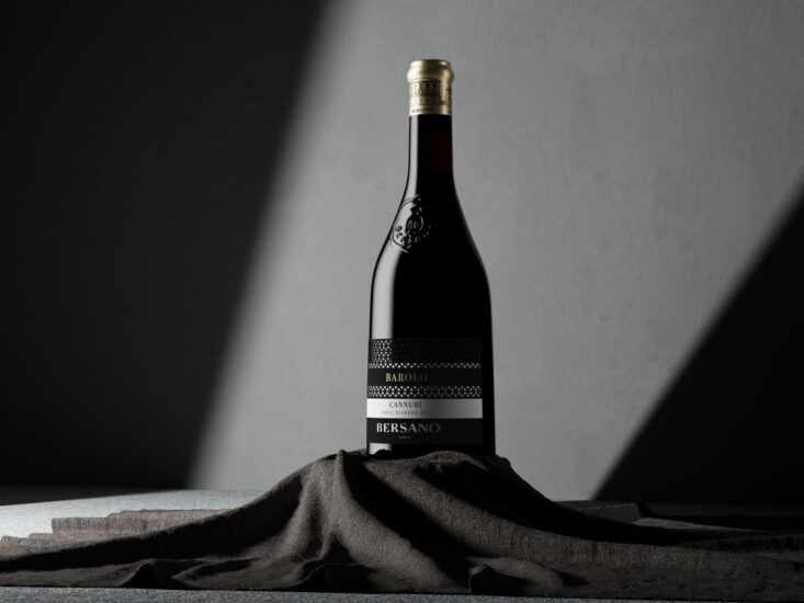
For Bersano, the new design emerges at a time when the wine market is calling for clearer, stronger, and more coherent signals. “Consumers drink less, but better. They look for quality, substance, beauty, and want to recognize the real value of what they choose. It is precisely in this space, between concreteness and desirability, that Bersano aims to strengthen its role”, underlines Federico Orione, the fifth generation, now leading the company sales & marketing activities. The company, founded in 1907 in Nizza Monferrato, directly oversees the entire production chain, from vineyard to bottle, through ten owned estates spread across the Langhe and Monferrato, where major indigenous Piedmontese grape varieties are cultivated - Barbera, Nebbiolo, Ruché, Brachetto, and Moscato - alongside experimentation with international varieties. An experimentation which today returns to where it all began: the bottle, whose silhouette is revived and reinterpreted in a contemporary way. “Imperfection, when it comes from human hands and history, is not a flaw: it is identity - explains Mario Di Paolo, founder of Spazio di Paolo - in rethinking this bottle, we chose to start precisely from this principle, recovering the authentic language of ancient hand-blown bottles. The slight asymmetries which once were the natural hallmark of craftsmanship now become a distinctive and recognizable element. In a landscape dominated by standardization, we wanted to restore uniqueness, character, and authenticity to an object capable of telling time, memory, and the human gesture. That is where craftsmanship meets the future, turning imperfection into a value and history into a continuous opportunity for innovation”.
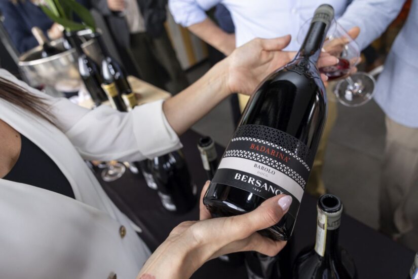
In dialogue with the historic bottle, there is a radically new label, developed with Spazio di Paolo. The project works through layering, materiality, and visual surprise: two overlapping labels form one, with a perforated lace-inspired motif that reveals the bottle glass beneath. Fine papers, foil detailing, embossing, and a short tin capsule featuring a detail inspired by the historic headquarters in Nizza Monferrato complete a tailored, elegant, and sophisticated packaging, designed to accompany the bottle without overpowering it. The result is a balance between history and contemporaneity, between memory and innovation. “The bottle allows us to be recognized from afar. The label brings people closer, surprises, creates a relationship. The capsule leaves a detail to remember”, recalls Federico Orione, for whom “beauty is not an accessory: it is part of the experience”.
The restyling begins with the Icons line, which brings together the most representative expressions of Bersano viticultural and production heritage. Each wine is conceived as an interpretation of an estate, an origin, a Piedmontese grape variety, in a selection designed to give shape to the most identity-driven part of the company production.
“For us, the Icons represent the essence of Bersano - continues Federico Orione - they are the most representative wine of each estate, the clearest expression of our idea of Piedmont. Starting from here meant working on the very heart of the brand, adding the final piece to a value-enhancement journey which begins in the vineyard and reaches all the way to the perception of the product”.
In the history of Bersano, perhaps more than in any other, “the bottle tells who we have been - cocnludes Federico Orione - it is a strong, recognizable sign, deeply ours. Revisiting it today doesn’t mean looking back, but giving new strength to an authentic element of our identity”. The redesign of the Icons marks the beginning of a broader phase of evolution in the Bersano identity: a direction which will progressively touch product, language, distribution, spaces, and the relationship with consumers, with the aim of strengthening the winery role as a contemporary interpreter of Piedmont wine heritage. Bottle after bottle.
Copyright © 2000/2026
Contatti: info@winenews.it
Seguici anche su Twitter: @WineNewsIt
Seguici anche su Facebook: @winenewsit
Questo articolo è tratto dall'archivio di WineNews - Tutti i diritti riservati - Copyright © 2000/2026
")


")


, but decrease under 50 million hectoliters")


, Piedmont (+0.5%), Tuscany (-8.3%) on the podium")

")


")


")


")


")


")


 2026")


")


")


")


 - La Selvanella 2025 (300x250)")


")
")
")
")
")


 2026 (300x120)")

")
")
")


")


")

")


")
")


")


")
")


")


")
")

")


")
")
")


")
")
")

")


")

")
")
")
")
")

")
")

")
")

")
")
")
")

")
")
")
")


")